(Last updated 12/15/2022)
Current Status of Front Range Cities Denver, Colorado Springs, and Pueblo
This page is a snapshot of the state of the real estate market from Denver, Colorado Springs, and Pueblo. Shown are three graphs below (Figure 1.) As I’m most interested in the Front Range of Colorado from Denver to Pueblo, I’m including snapshots of what’s happening there. Generally, green means good for a seller, and red means good for the investor.
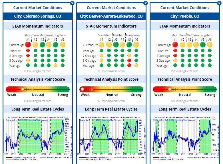
Figure 1 – Rough indicators for Denver, Colorado Springs, and Pueblo, Colorado real estate.
Analysis
Wow! What a difference 3-months makes. In September the STAR Momentum indicators for Pueblo and Colorado Springs were very strong both short-term and long term. Denver looked like it had some concern in the long term, but otherwise appeared strong. The TAPS graphs suggested that all these areas were strong seller’s markets. Now, they are all verging toward weak. That’s a 180 swing.
From a wealth accumulation point of view, Denver, the largest market in Colorado, reflects the state of Colorado. All three graphs indicate that these areas in Colorado are still appreciating markets but appreciation has dropped significantly to 5-6%, less than half of what the appreciation was in mid-September.
Notice that the long-term and short-term moving averages crossed over in the last year and continue to diverge.
We’re seeing a significant dip in appreciation which we have been anticipating since the two moving averages crossed last year. If it continues in this manner, expect housing prices to drop sharply and monthly inventory to grow in all three markets. At this rate, within 6 months it will be a buyer’s market.
Key to Graphs
The first set of graphs is the Six Trigger Alert Reports (STAR). There are six momentum indicators ranging from short-term indicators on the left to long-term indicators on the right for Denver, Colorado Springs, and Pueblo. Roughly, green is good if you’re a seller, red is good if you’re a buyer. The indicators go back in time as you go down each row on the graph.
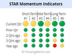
Figure 2 – STAR Momentum Indicators for the State of Colorado. The indicators for the current quarter (top row) suggest that the short-term through long-term indicate a weakening seller’s market for Colorado. A year ago, bottom row, was still pretty good. (These graphs are from HousingAlerts.com. This is just a quick snapshot of what HousingAlerts.com has to offer. Go to my home page to get a free version for your state.)
The next graph (Figure 3) indicates the Technical Analysis Point Score (TAPS.) Each market is graded using a series of technical criteria. (I don’t really know the details.) Again, green is good, red is bad. You can see that Colorado as a whole, has gone from very strong trending to weak./H2>
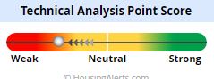
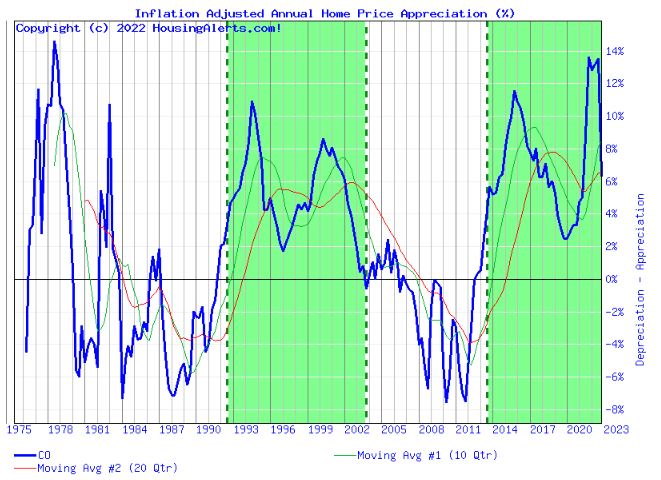
Figure 4 shows the wealth accumulation as a percentage of the state of Colorado. Green areas are when the market is appreciating and white areas are when the market is depreciating.