Current Status of Front Range Cities Denver, Colorado Springs, and Pueblo
This page is a snapshot of the state of the real estate markets from the Denver area, Colorado Springs, and Pueblo. Shown below are three graphs of the status of each of these markets (Figure 1.) As I’m most interested in the Front Range of Colorado from Denver to Pueblo, I’m including snapshots of what’s happening there. Generally, green means good for a seller, and red means good for the investor.
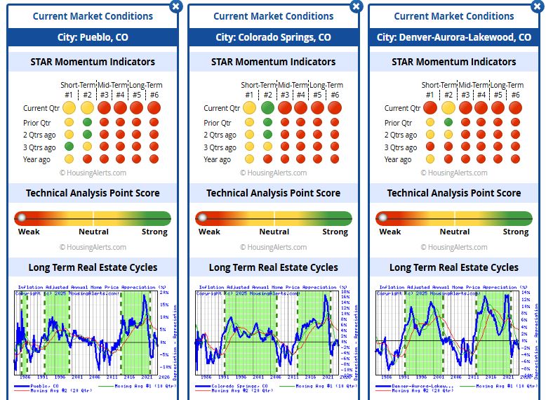
Figure 1 – Current State of Colorado Markets
Analysis
The market for Colorado Springs, Pueblo, and Denver is a little weaker than it was in December 2024, and it has returned to a depreciating market. All three STAR momentum indicators look virtually identical being red, with the #2 market indicator being the lone short-term indicator showing green. All of the mid-term and long-term indicators are currently red and have been for the last year or so. Colorado Springs is the only area showing green, indicating for that short-term indicator that Colorado Springs continues doing pretty well. The Technical Analysis Point Score (TAPS) graphs showing all these areas are solidly weak.
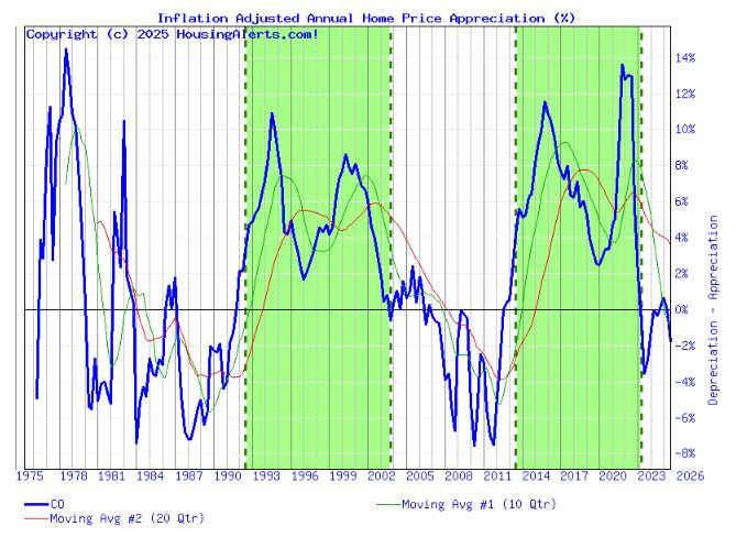
State of Colorado
From a wealth accumulation perspective, Denver, the largest market in Colorado, reflects the state of Colorado. The three individual graphs indicate that they are going in the same direction: down. The rest of the state is still showing increasing depreciation, too. Colorado as a whole is a weak market.
Figure 2 shows the wealth accumulation as a percentage of the state of Colorado. Green areas are when the market is appreciating and white areas are when the market is depreciating. But if you look at the green (10 quarters) and red (20 quarters) lines of moving averages, you’ll notice that the market changes when these two lines cross over each other. You can see at the far right that these two lines crossed over signifying a significant change in market direction for Colorado that is now manifesting itself. Colorado entered a depreciating market over the last year or so.
Explanation of graphs
The first set of graphs (Figure 3) is the Six Trigger Alert Reports (STAR). There are six momentum indicators ranging from short-term indicators on the left to long-term indicators on the right for Denver, Colorado Springs, and Pueblo. Normally, green is good if you’re a seller, and red is good if you’re a buyer. (Normally, but the market is a little wonky because of really low interest rates people got on their houses during 2020-2022.) The indicators go back in time as you go down each row on the graph.
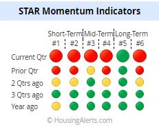
The indicators for the current quarter (top row) suggest that the short-term through long-term indicate a weak seller’s market for Colorado. A year ago, all the momentum indicators except for Short-Term #1 were green. (These graphs are from HousingAlerts.com. This is just a quick snapshot of what HousingAlerts.com has to offer. Go to my home page to get a free version for your state.)
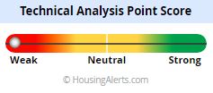
The next graph (Figure 4) indicates the Technical Analysis Point Score (TAPS.) Each market is graded using a series of technical criteria. (I don’t really know the details.) Again, green is good for home sellers, and red is bad for home sellers, but good for investors. You can see that Colorado has moved into the weak zone.