(last updated 9/15/2022)
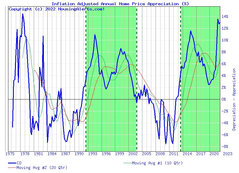
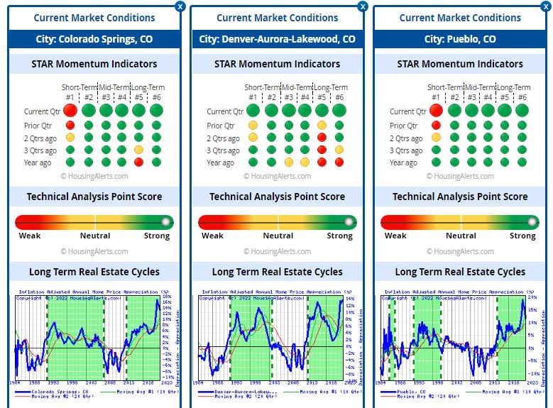
This page is a snapshot of the state of the real estate market from Denver, Colorado Springs, and Pueblo. Shown are three graphs below (Figure 1.) As I’m most interested in the Front Range of Colorado from Denver to Pueblo, I’m including snapshots of what’s happening there. Generally, green means good for a seller, and red means good for the investor.
Analysis
From the STAR Momentum, All the indicators suggest Pueblo and Colorado Springs are very strong from short-term to long-term. Denver looks like it has some concerns in the long term.. From the TAPS graphs, these are all strong seller markets. From the wealth accumulation point of view, Denver, the largest market in Colorado, reflects the state of Colorado. All three graphs indicate that these cities in Colorado are appreciating markets.
Notice, that the long-term and short-term moving averages crossed over and a change in the market direction is occurring. We’re seeing a slight dip in appreciation. This is something to watch. Across the U.S. some markets are facing significant headwinds with up to 40% drop in home values. Redfin shows that the current median home price in Colorado Springs is $465K. There is a surge in the number of price reductions to 27%. About the same number as in August 2019.
Key to Graphs
The first set of graphs is the Six Trigger Alert Reports (STAR). There are six momentum indicators ranging from short-term indicators on the left to long-term indicators on the right for Denver, Colorado Springs, and Pueblo. Roughly, green is good if you’re a seller, red is good if you’re a buyer. The indicators go back in time as you go down on the graph.
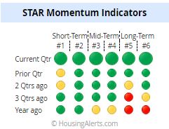
Figure 2 – STAR Momentum Indicators for the State of Colorado. The indicators for the current quarter (top row) suggest that the short-term through long-term indicate a strong seller’s market for Colorado. A year ago, the bottom row, wasn’t so bright. (These graphs are from HousingAlerts.com. This is just a quick snapshot of what HousingAlerts.com has to offer. Go to my home page to get a free version for your state.)
The next graph (Figure 3) indicates the Technical Analysis Point Score (TAPS.) Using a series of technical criteria a market is graded. Again, green is good, red is bad. You can see that Colorado as a whole, remains very strong.
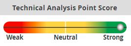
Figure 4 shows the wealth accumulation as a percentage of the state of Colorado. Green areas are when the market is appreciating and white areas are when the market is depreciating.